
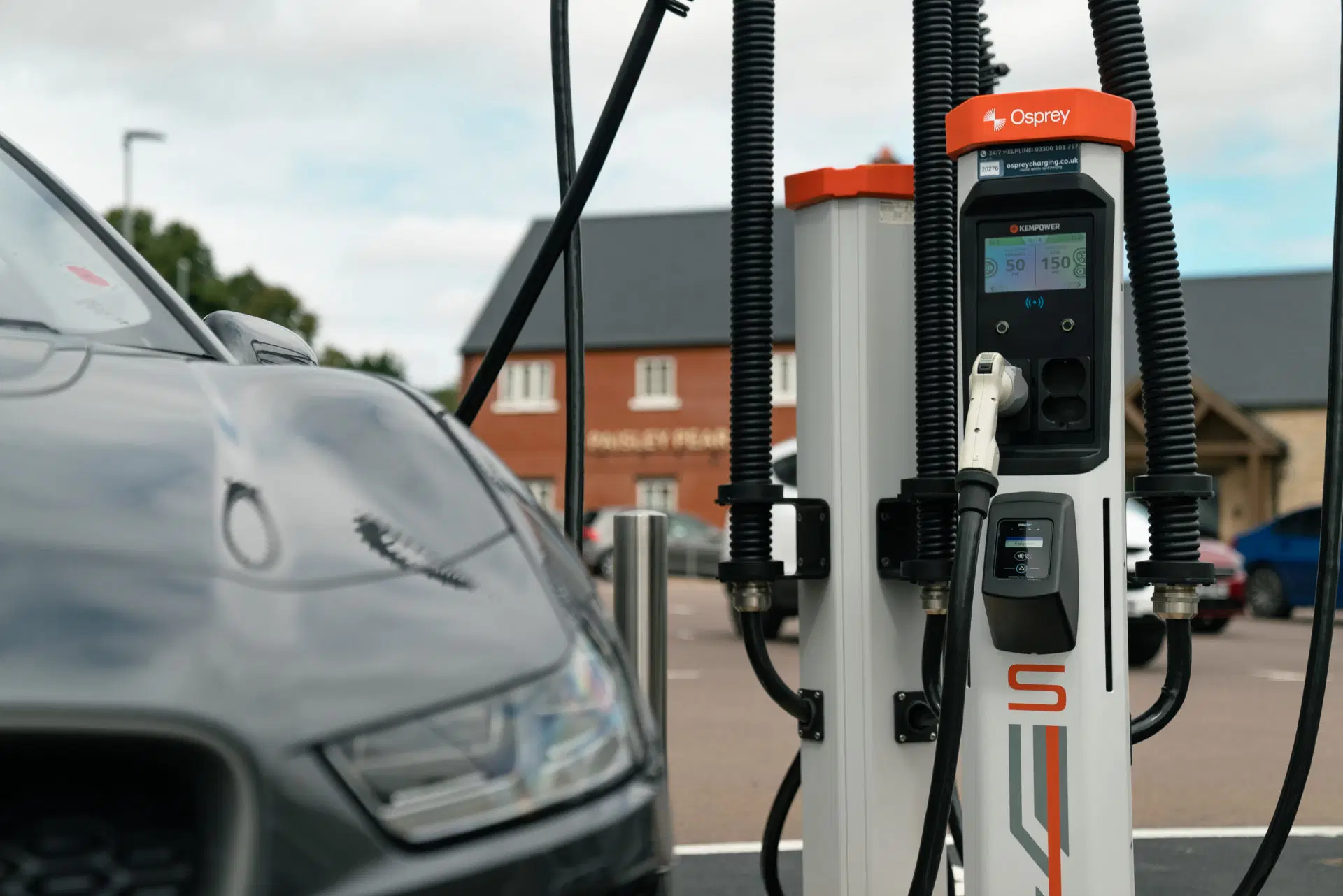
Osprey uses Adyen payment terminals to support contactless payment for EV charging. While Adyen handles the payment flow, the terminal has limited awareness of charger state, creating ambiguity during key moments such as starting and stopping a charge — particularly at sites where a single terminal serves multiple connectors.
This work explored how a custom terminal app could bridge that gap by aligning terminal UI states with backend and charger events. The focus was on defining a clear, reliable terminal experience within the constraints of Adyen hardware, fixed payment screens, and real-world connectivity issues, while supporting walk-up use without reliance on a mobile app.
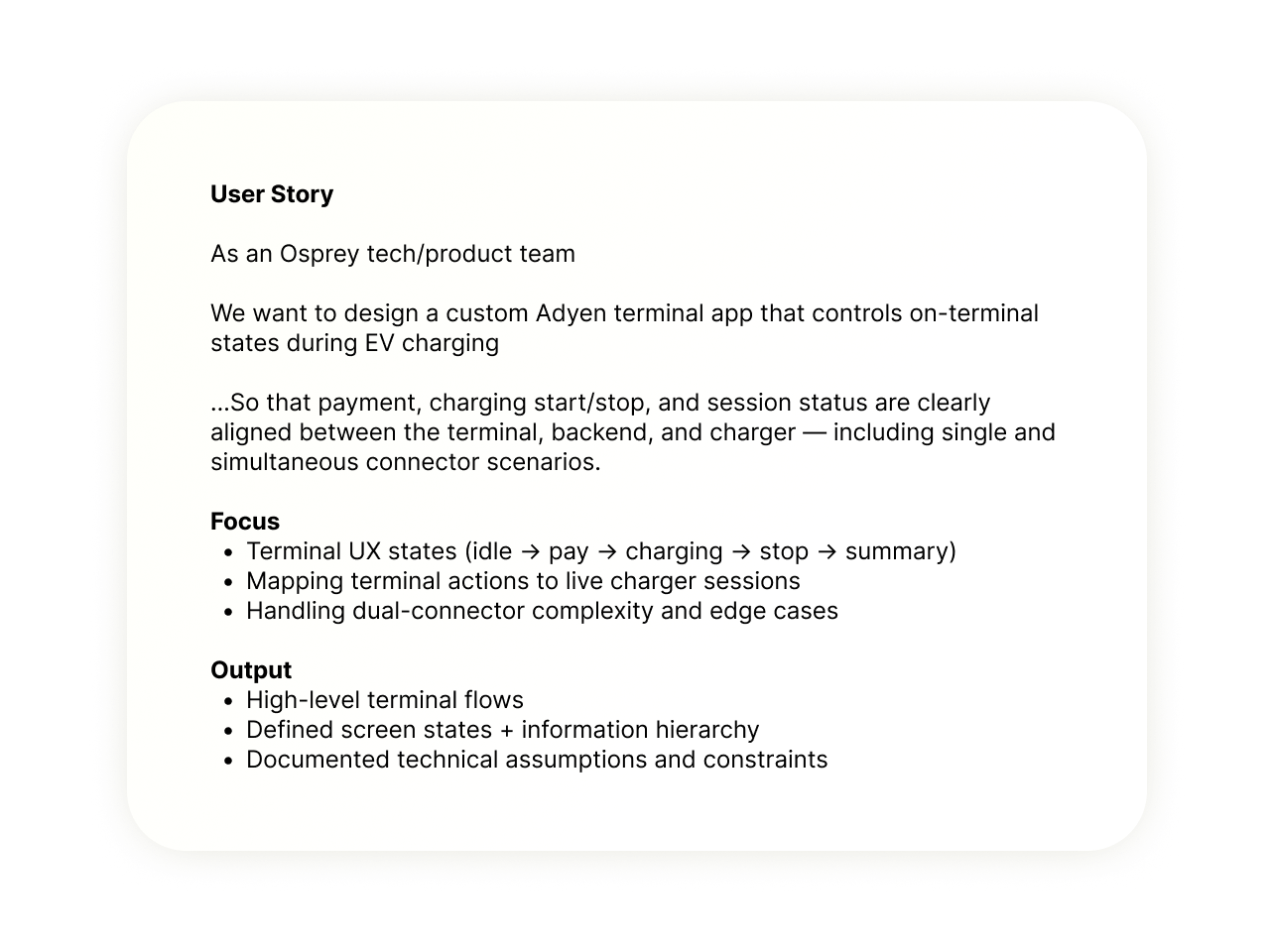
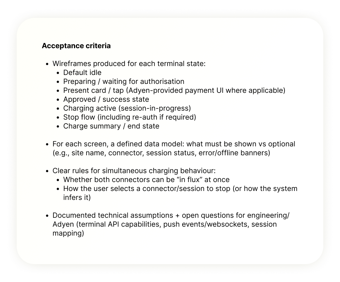
The terminal app had to work within the limitations of fixed hardware and alongside an existing charger screen, rather than replacing it. Designs needed to be clear and legible on a small display, handle multiple charging states, and remain reliable across thousands of locations. There was also a need to create a lightweight design system that could scale across terminals without becoming overly complex. Fixed Adyen payment screens cannot be modified Split-screen or dense layouts are impractical Terminal UX must work without assuming the user has a phone Offline scenarios (terminal vs charger) must be handled explicitly
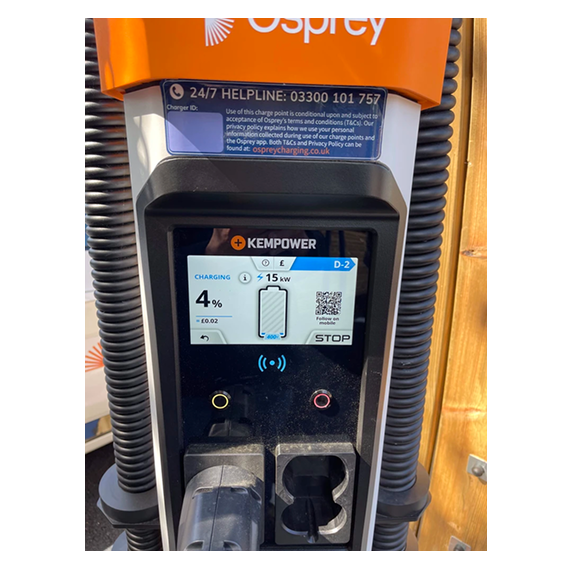
To ground the work, I reviewed existing Wallbox and terminal-based charging flows from Osprey and other operators (including Kempower and Tesla for references).
The goal was to understand how payment terminals behave in real-world charging scenarios before proposing a custom terminal app.
These findings informed:


I wanted users to have a seamless and intuitive experience when initiating payments at the charging terminal. By simplifying the steps and making the payment process really clear, I reduced user confusion and made sure that even first-time users could get through it without any hassle.

Ensuring that the interface was accessible to all users in real world settings was key to the projects success. We conducted real world testing and designed with accessibility principles guiding the designs , so that the terminal app could be used comfortably by people with different levels of tech familiarity.
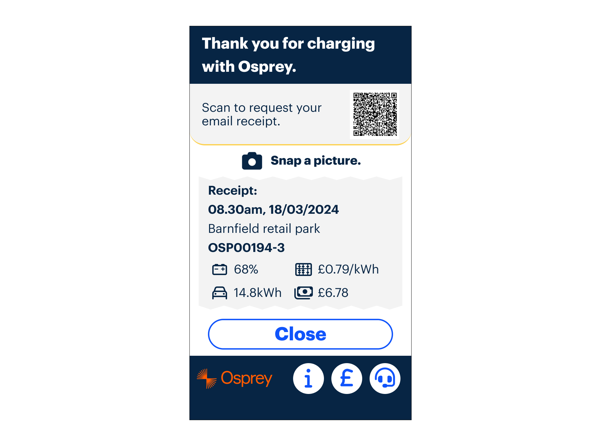
At the end of the charging session, we wanted to make sure users had a simple and clear way to get their receipt. Offering a scannable QR code or an easy receipt process ensured a smooth wrap-up to the whole experience. By leaving the QR code on screen for up to a minute, we considered user context of retrieving their device ad being able to scan easily.
I designed a custom terminal app that replaced rigid payment flows with a clearer, driver-first experience. By focusing on simplified data, predictable states, and robust error and recovery flows, the app worked smoothly alongside the charger screen and scaled across thousands of terminals. A small, purpose-built design system ensured consistency while remaining flexible enough to adapt to different charging scenarios.
Defined a terminal state framework
Mapped a finite set of terminal states (idle, payment, authorising, charging active, stop, summary, error) to backend and charger events, forming the foundation for all terminal UI behaviour.
Separated system-controlled and custom screens
Clearly distinguished between fixed Adyen payment screens and custom Osprey screens, reducing risk while maximising control where it was technically feasible.
Designed single-action terminal screens
Created focused screens with one primary action per state, reducing interaction errors and supporting fast, glanceable use.
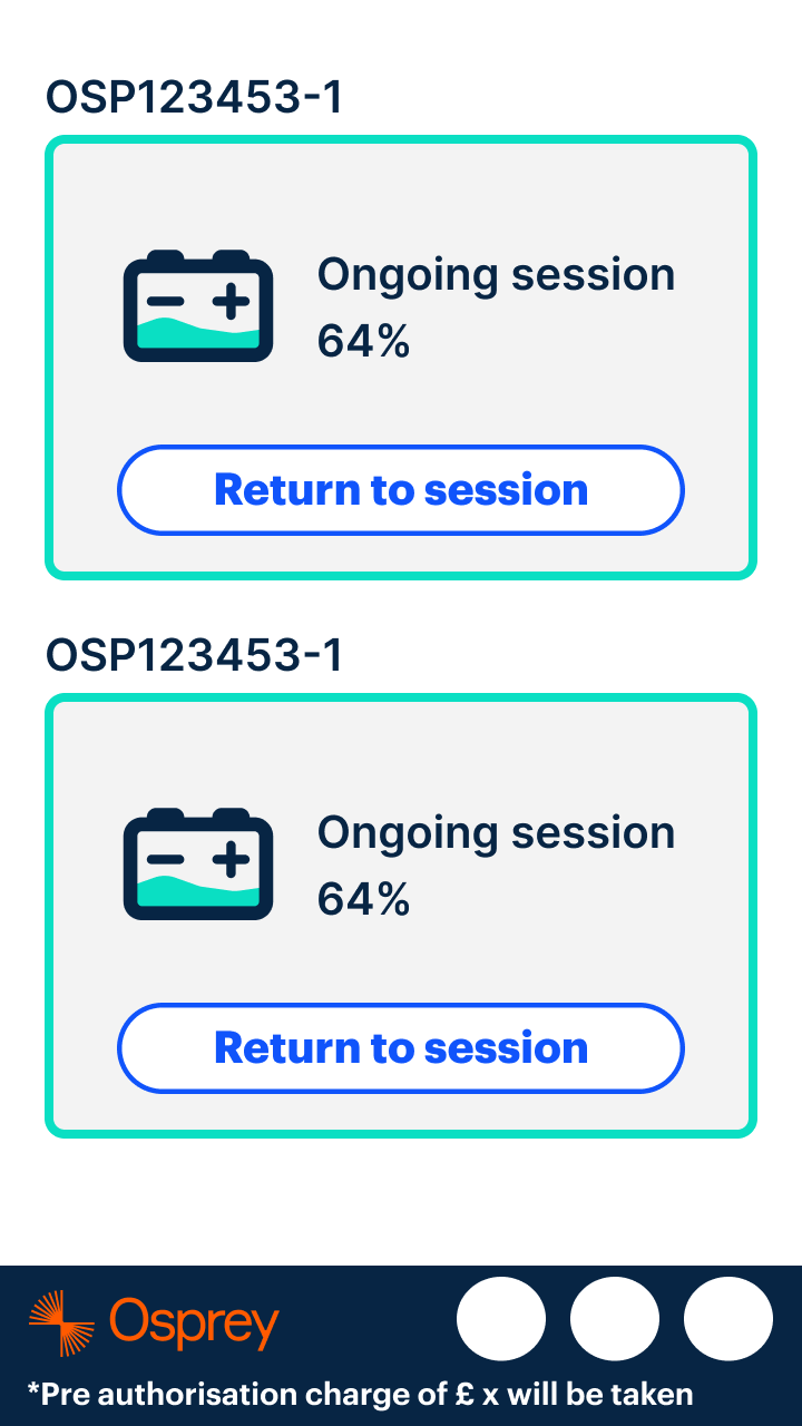
Handled dual-connector scenarios explicitly
Designed clear rules for how a single terminal behaves when two connectors are in use, including session identification and stop-charging behaviour.
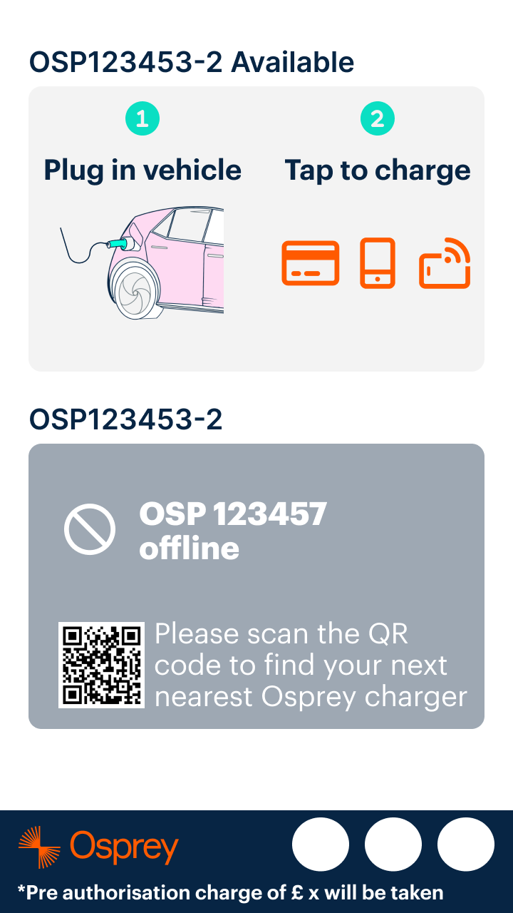
Introduced explicit offline and failure states
Added clear terminal feedback for offline terminals, unavailable chargers, and failed payments, preventing silent failures and user confusion.
Optimised for walk-up use
Ensured the terminal experience works end-to-end without requiring a phone or app, supporting first-time and public users.


Terminal UX is mostly about state management
The hardest part of the problem was not visual design, but defining a reliable state model that stayed in sync with backend and charger behaviour.
Payment terminals are not neutral surfaces
Adyen terminals impose fixed flows and constraints that meaningfully shape the user experience. Designing within those limits required early technical alignment rather than late-stage UI iteration.
Dual-connector setups multiply complexity quickly
What appears simple in single-connector scenarios becomes ambiguous when one terminal controls multiple sessions. These cases need to be treated as first-class, not edge conditions.
Offline scenarios drive real user frustration
Terminal and charger connectivity failures are common in the field. Making these states explicit was more valuable than attempting to mask them.
Constraints improved decision-making
Clear limits on screen size, modifiability, and available actions forced prioritisation and removed unnecessary UI complexity.
Early collaboration reduced rework
Working closely with engineering and payment providers during discovery prevented unrealistic designs and shortened iteration cycles later.
For enquiries about product design roles or collaborations, feel free to get in touch.
Some work is subject to confidentiality and can’t be shared publicly, but I’m happy to discuss further examples on request. I aim to respond within one business day.