
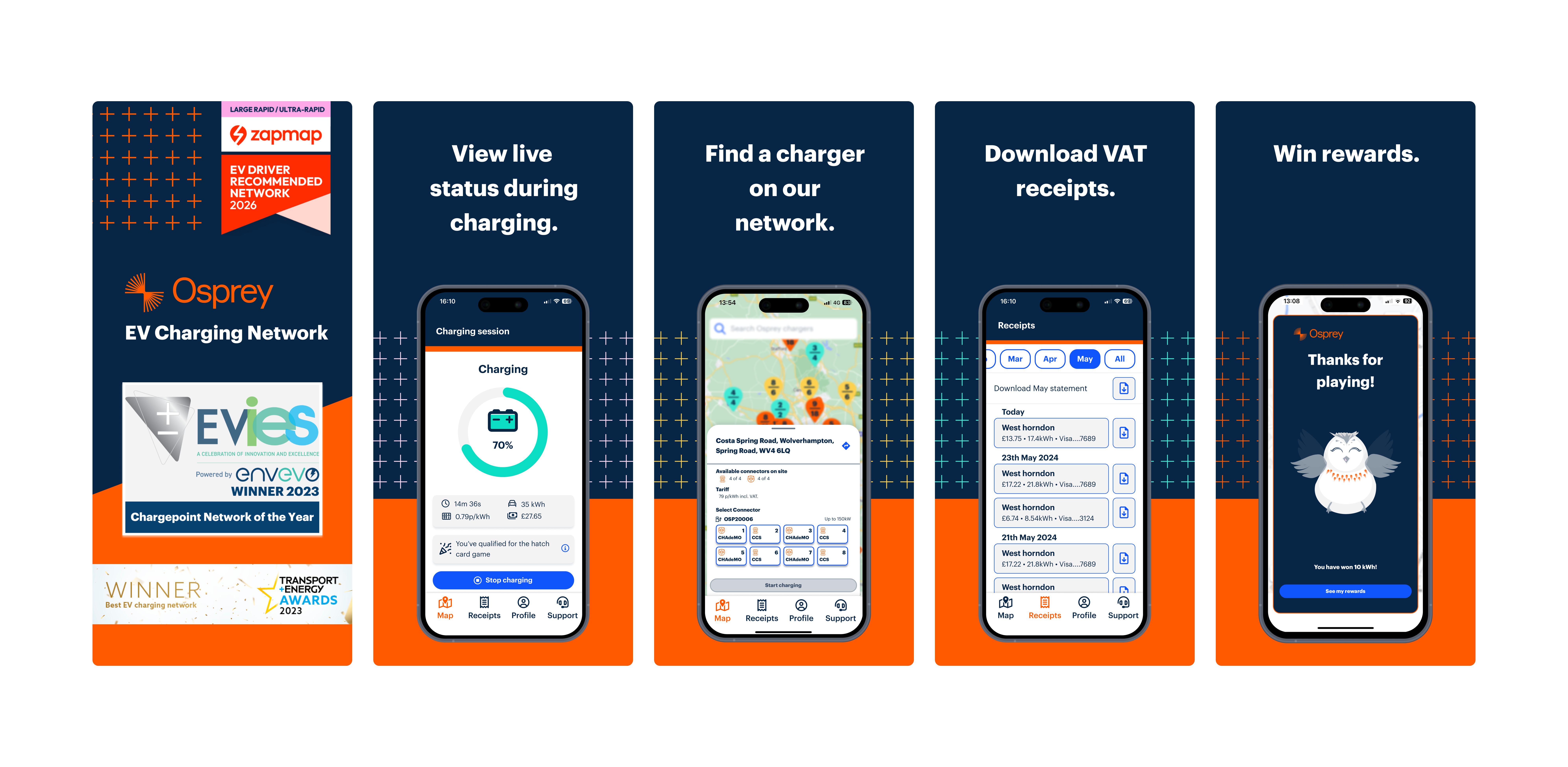
When I joined Osprey, the driver app had been largely neglected and there was no design system in place to support growth. My role was to step back and understand the full EV charging experience end to end — from arriving on site and reading signage, to using the app in real-world conditions, to receiving follow-up communications. This work sat within a live B2C product, tested and iterated with real customers as the user base grew, and directly informed how I redesigned the app and shaped a design system that prioritised clarity, accessibility, and ease of use.
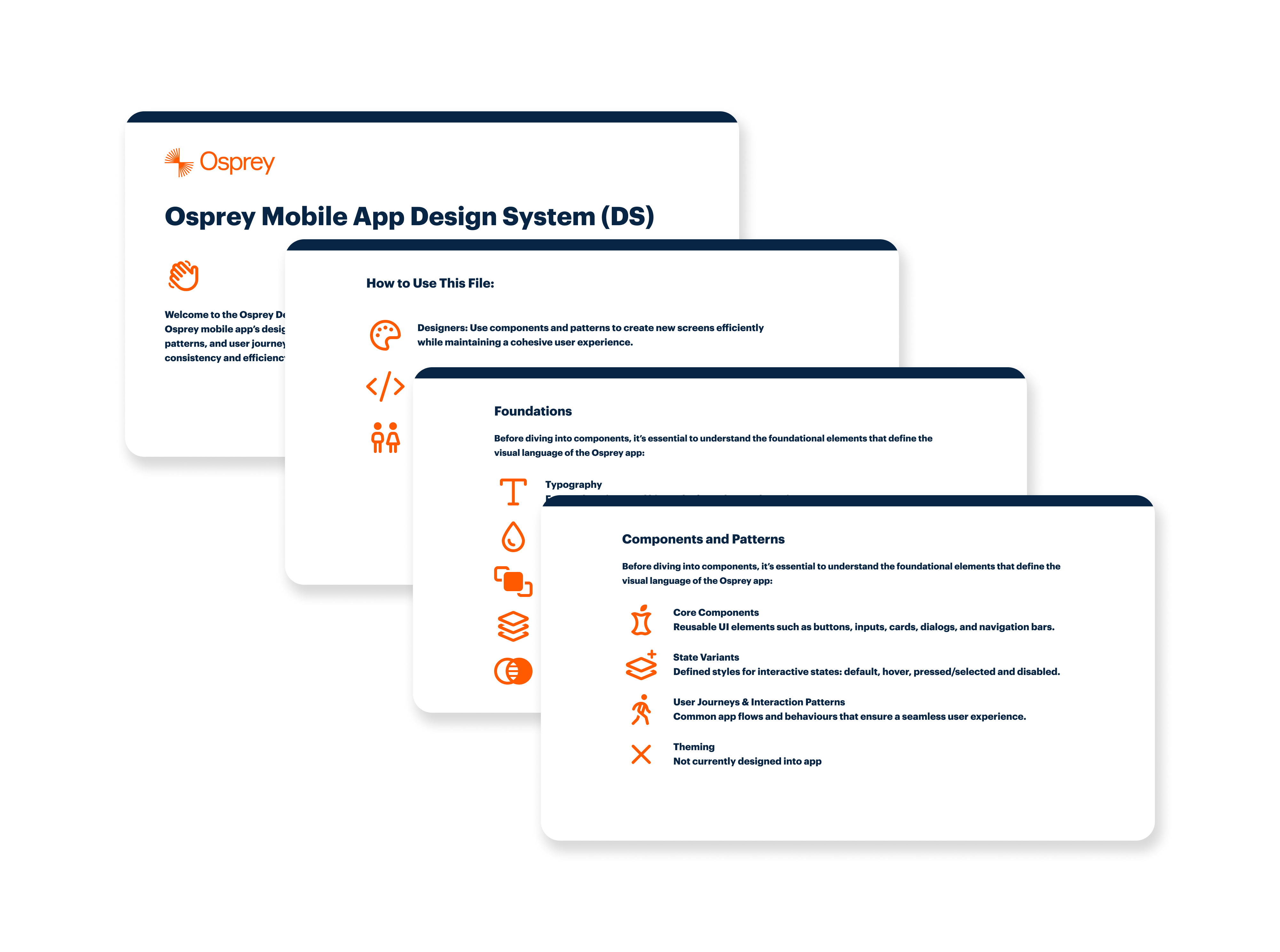
This work was done as the first in-house designer, with no existing design system or established product design function to build from. I needed to operate across research, interaction design, visual design, and systems thinking while working within a live product and a growing business. The starting point was intentionally lightweight, focusing on creating practical foundations that could evolve rather than over-engineering early solutions.
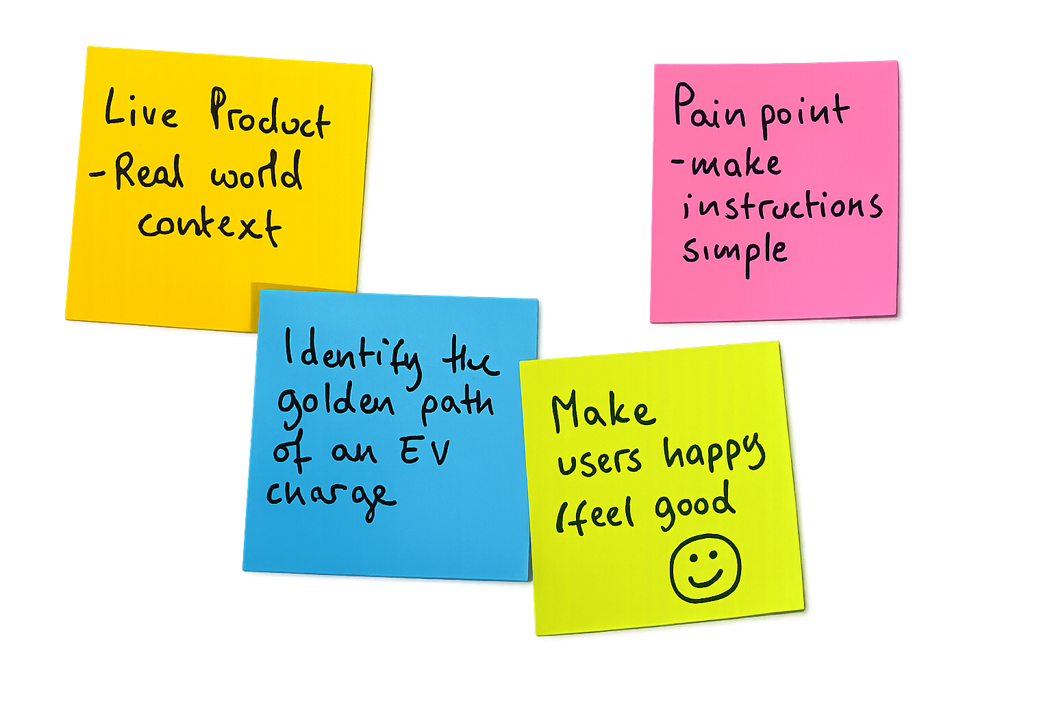
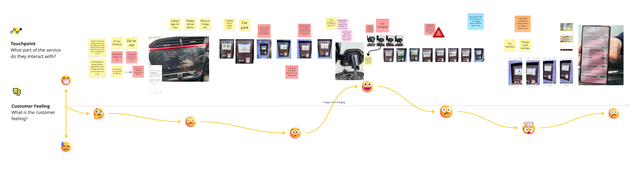
Discovery focused on understanding how the app was actually used in real charging situations. I carried out an audit of the existing app to identify usability issues, inconsistencies, alongside reviewing how key journeys were structured.
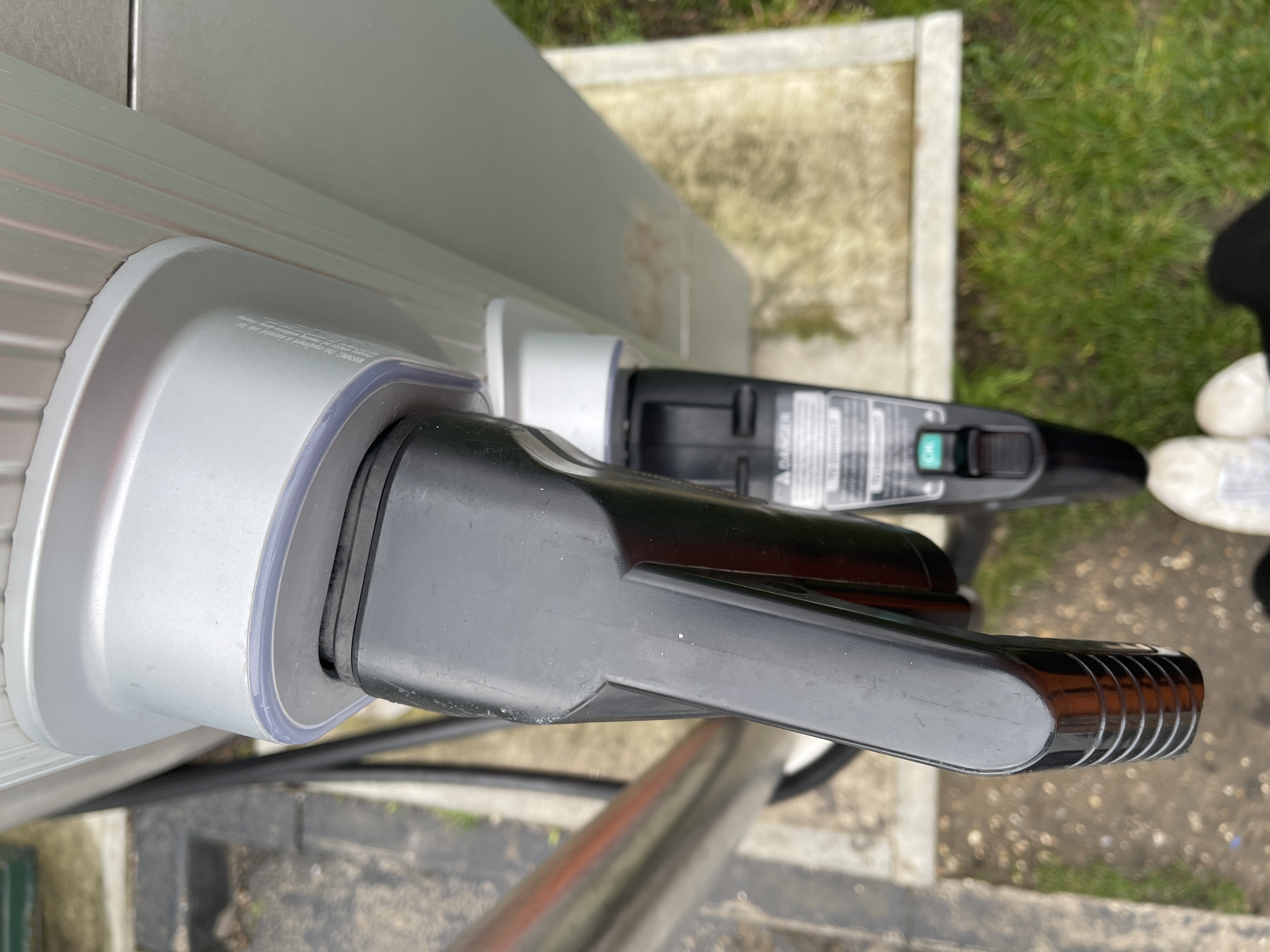
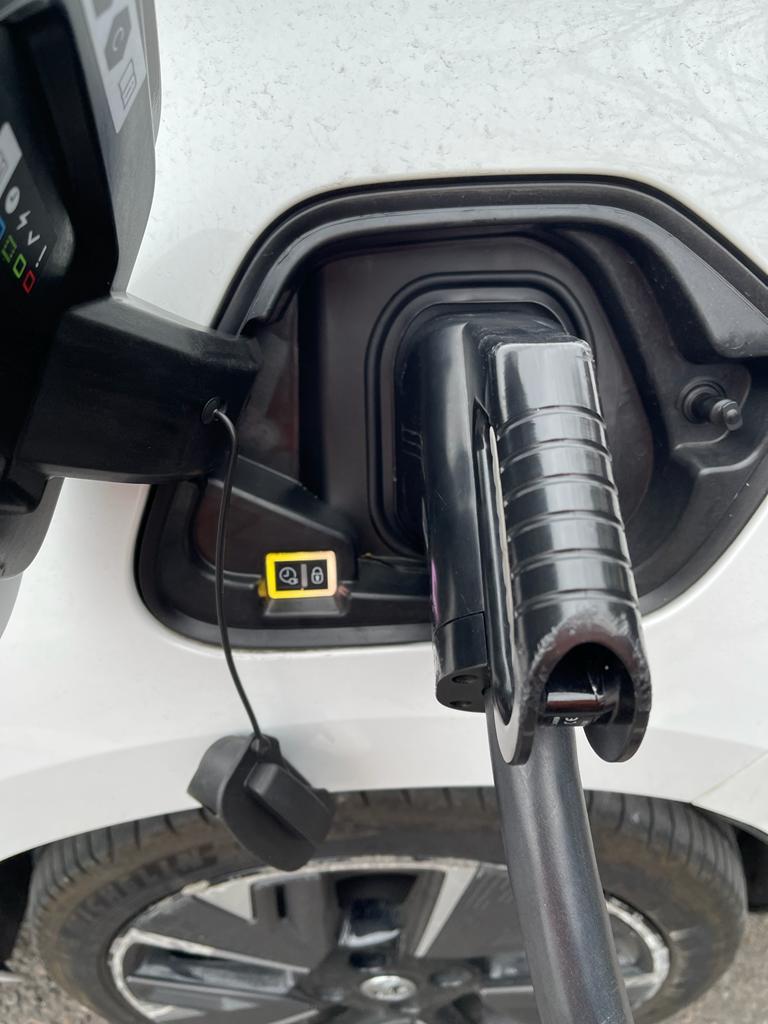
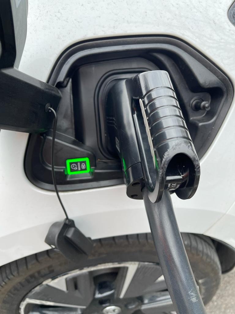
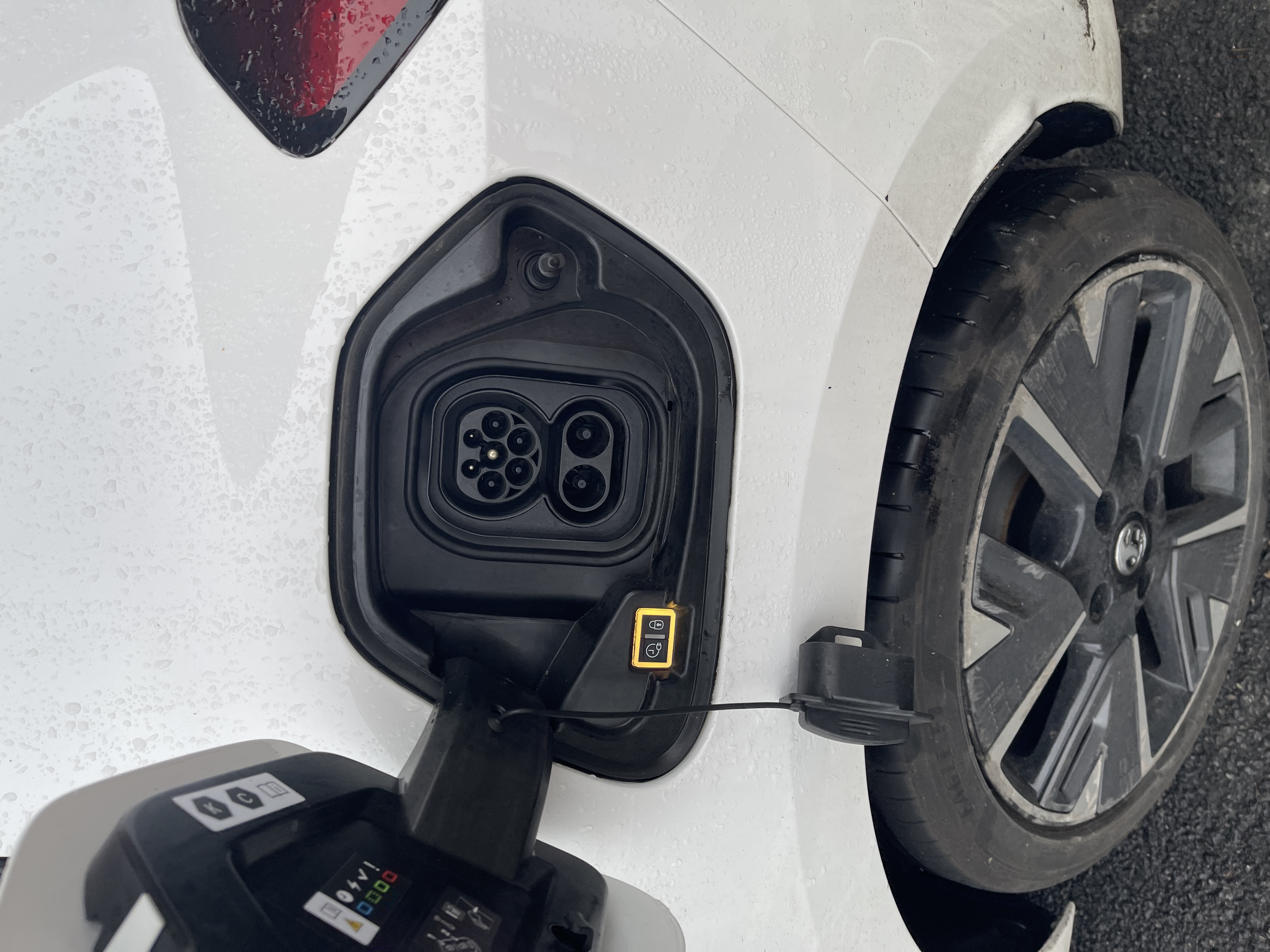
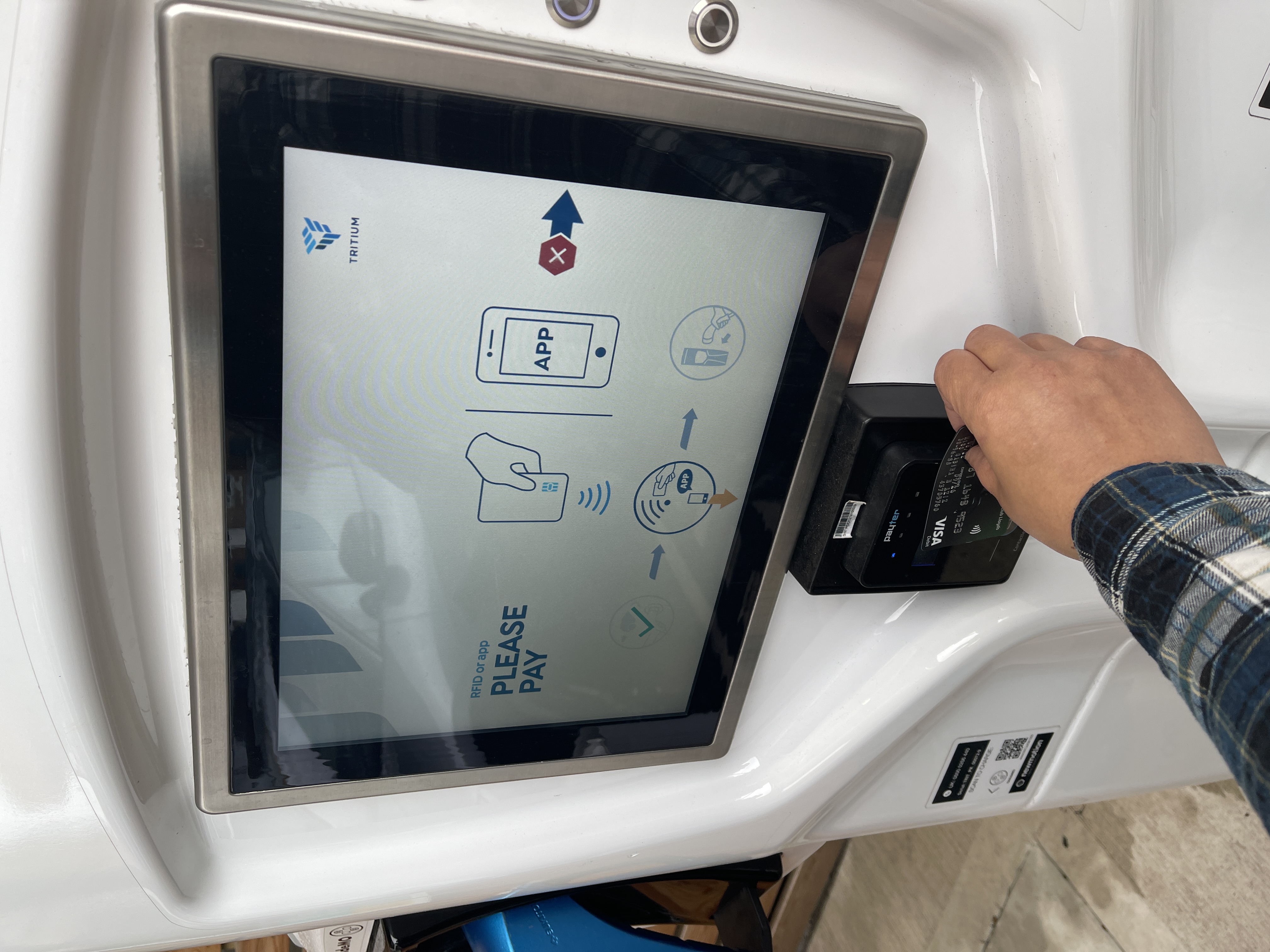
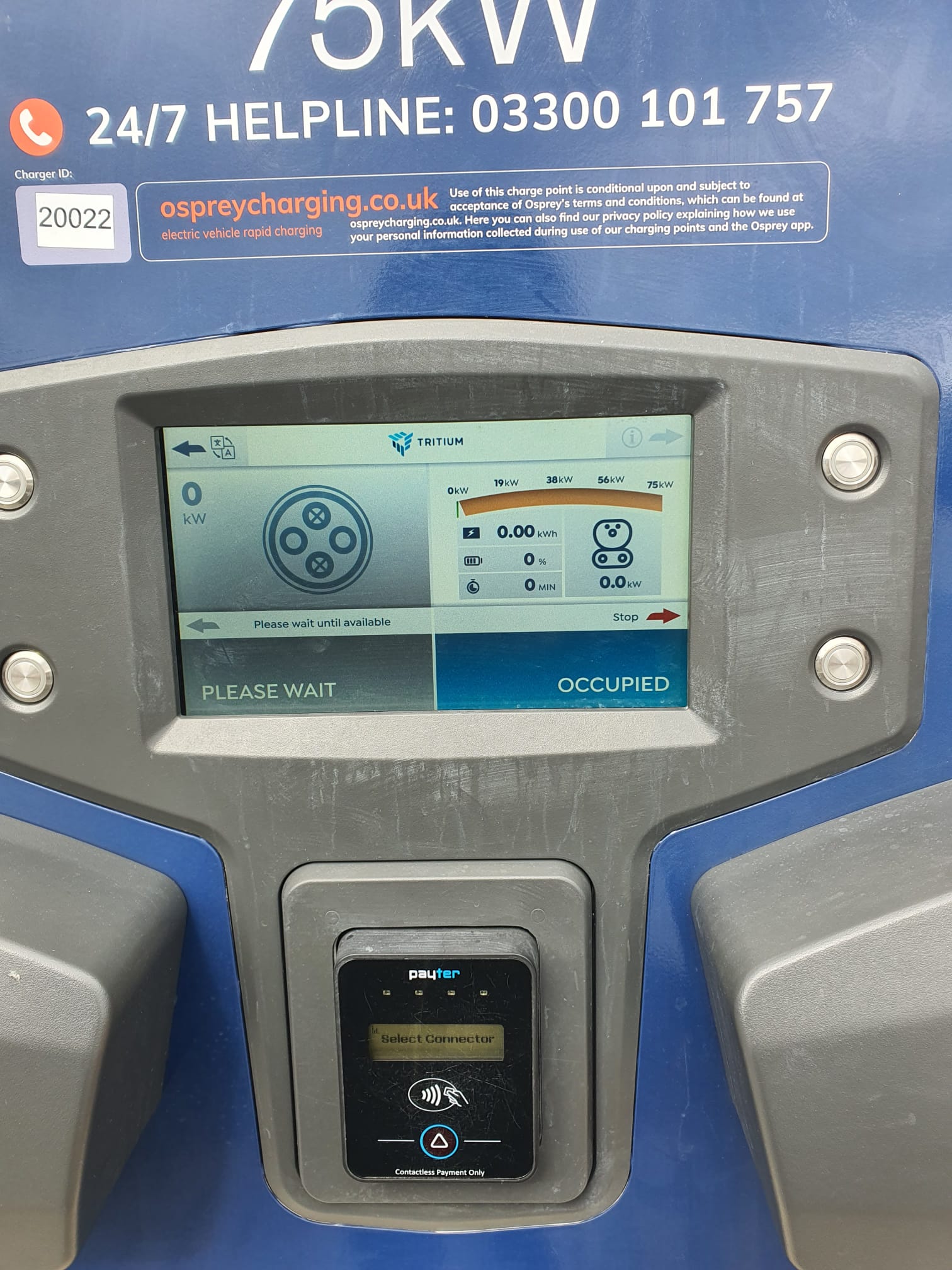
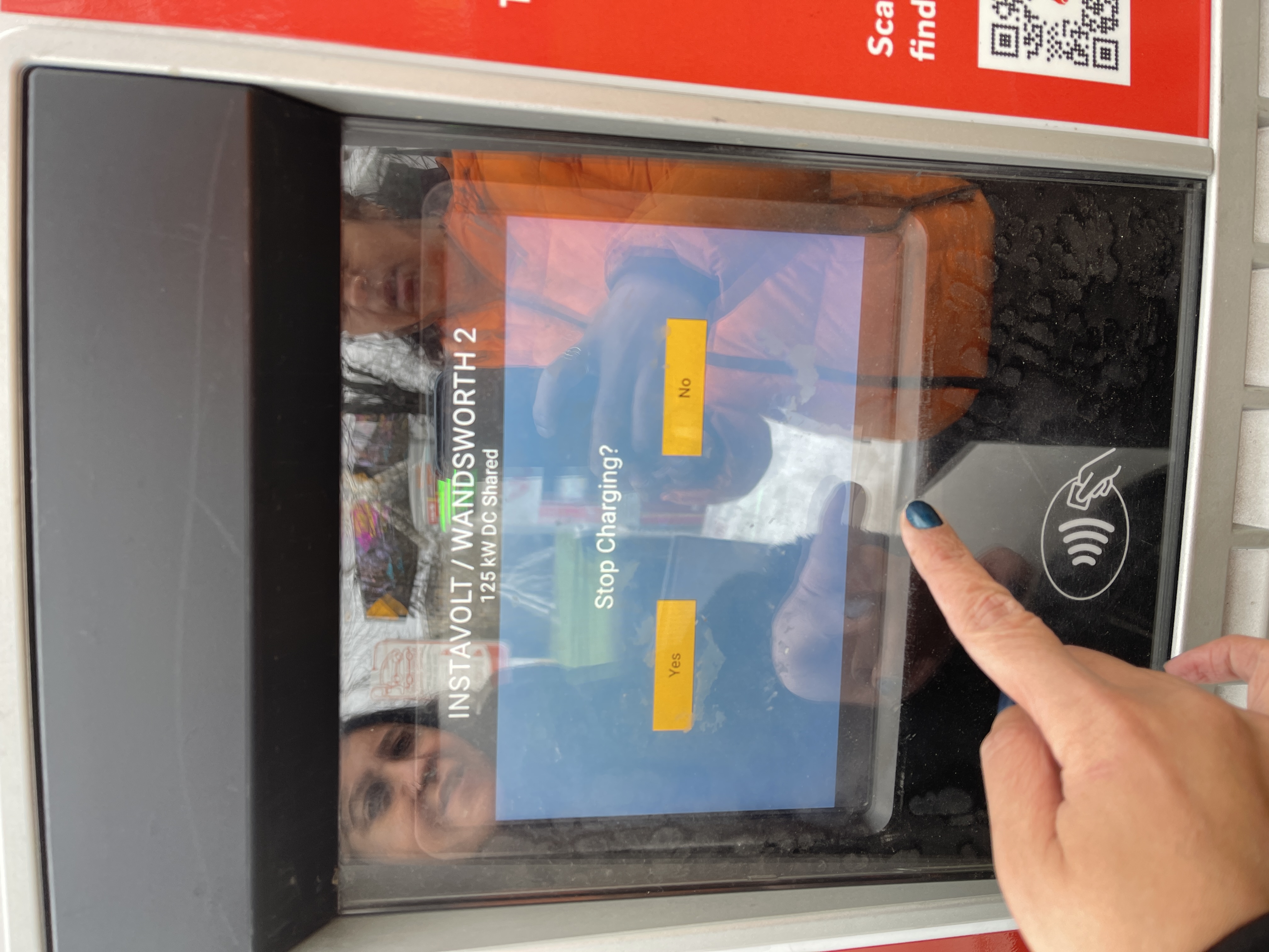
I then tested the experience in real-world charging environments, observing how drivers interacted with the app on site and where physical context, signage, and instructions either supported or hindered the digital journey. This helped surface moments of friction that wouldn’t have been obvious from screens alone.
Bringing this together, I mapped the full charging journey across physical and digital touchpoints, which created a clearer picture of where the experience needed to be simplified, clarified, or better connected.

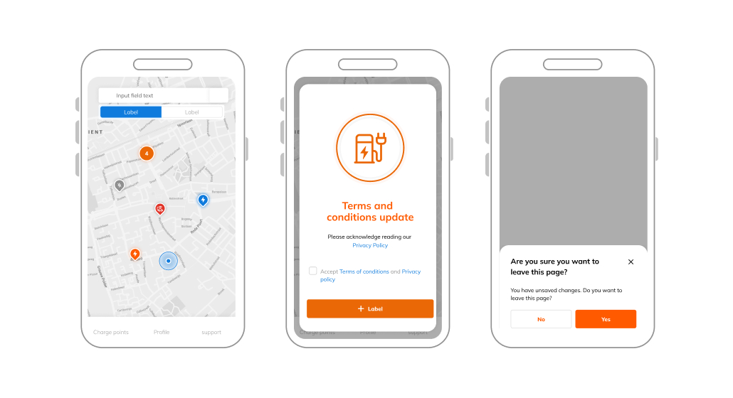
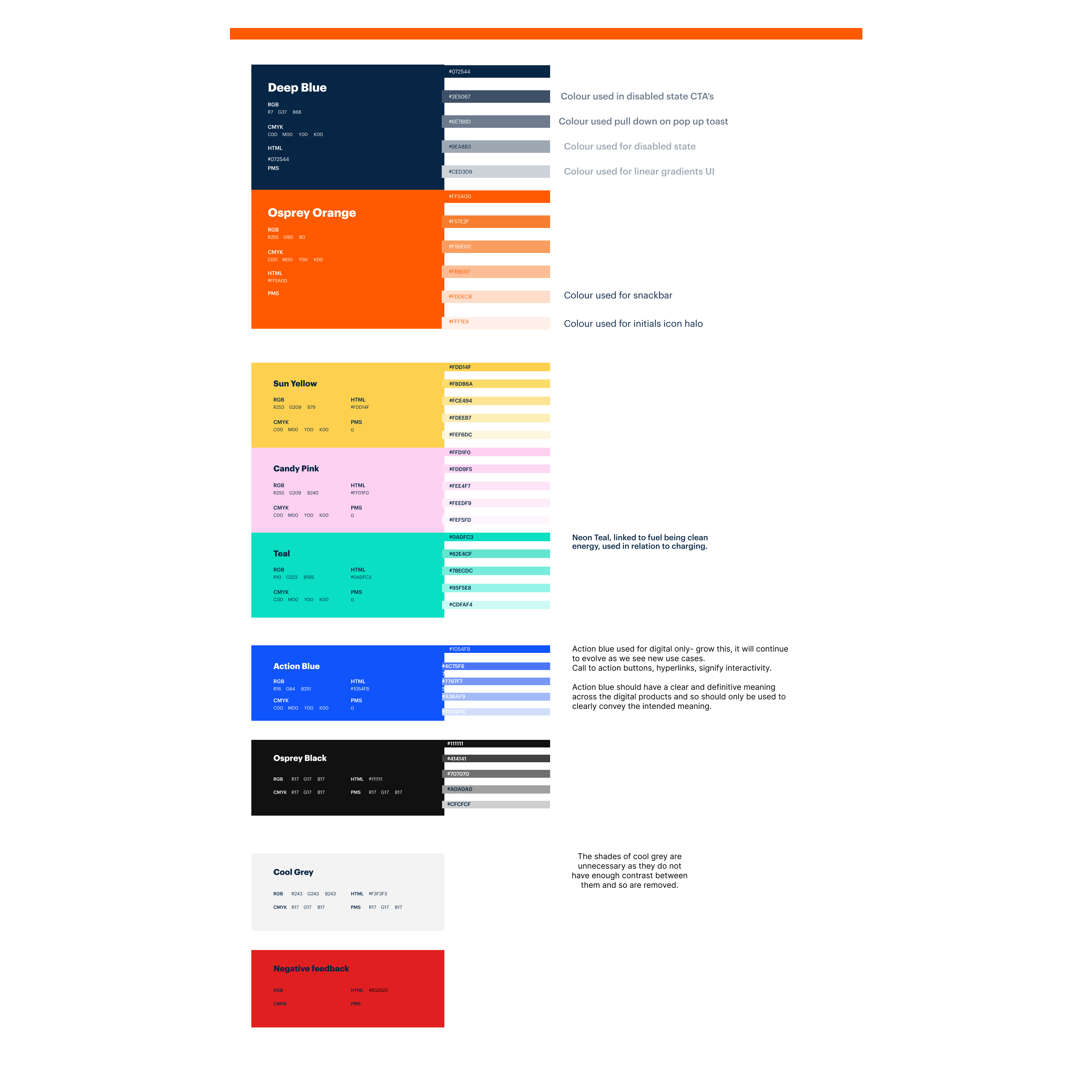
Creating a unified design system from scratch gave Osprey full control and consistency over the app’s look and feel. It meant we could move away from relying on an external agency and ensure that every component, from branding to UI patterns, was tailored exactly to our users’ needs and could evolve with the product.
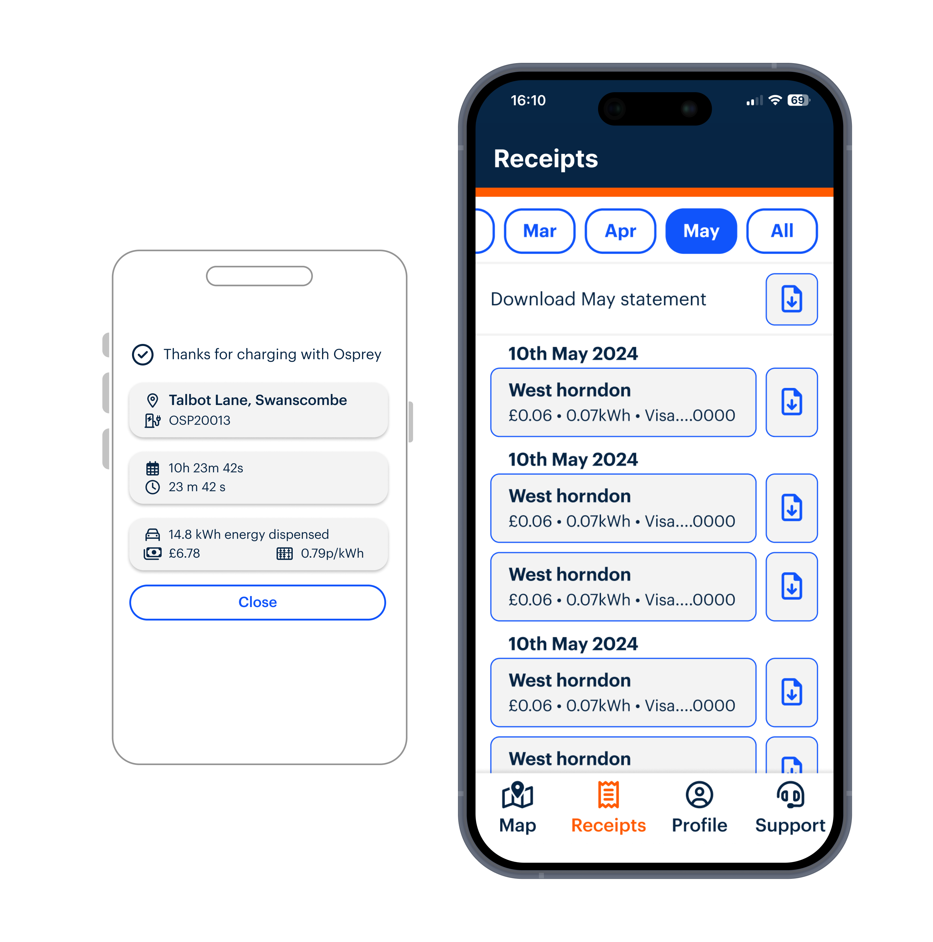
We carefully restructured how information was presented in the app, making sure that users could easily find what they needed and understand their charging status at a glance. This helped users feel more confident and reduced any confusion, ultimately leading to the user trusting their charging session was accurate and optimised.
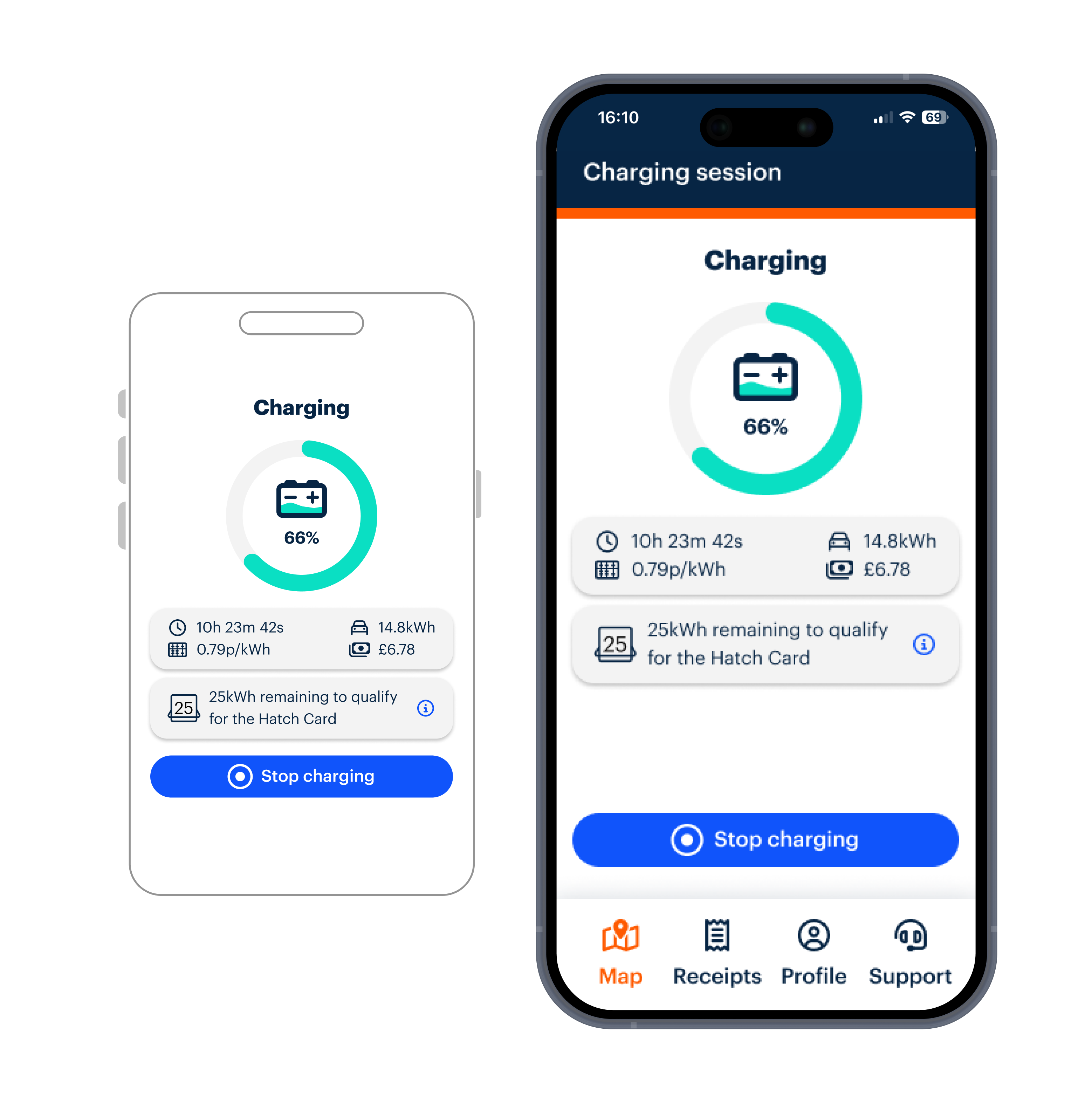
By auditing the existing app and minimizing the number of steps a user had to take to start a charging session, we made the experience faster and more intuitive. This not only improved user satisfaction but also reduced cognitive load, making the app more accessible and easy to navigate.
By grounding the redesign in real-world charging contexts and designing a system rather than one-off screens, I was able to reduce friction across the app while making the experience easier to understand at a glance. The design system created a shared foundation for teams to build consistently, while the redesigned journeys helped EV drivers feel more confident, supported, and informed throughout their charging sessions.

This project reinforced the value of designing for context, not just for screens. Working on a live, growing B2C product showed me how small clarity improvements can have an outsized impact when users are interacting with the app in real-world conditions. It also deepened my approach to systems-led design, demonstrating how investing early in flexible foundations can reduce friction for both users and teams as a product evolves.
For enquiries about product design roles or collaborations, feel free to get in touch.
Some work is subject to confidentiality and can’t be shared publicly, but I’m happy to discuss further examples on request. I aim to respond within one business day.